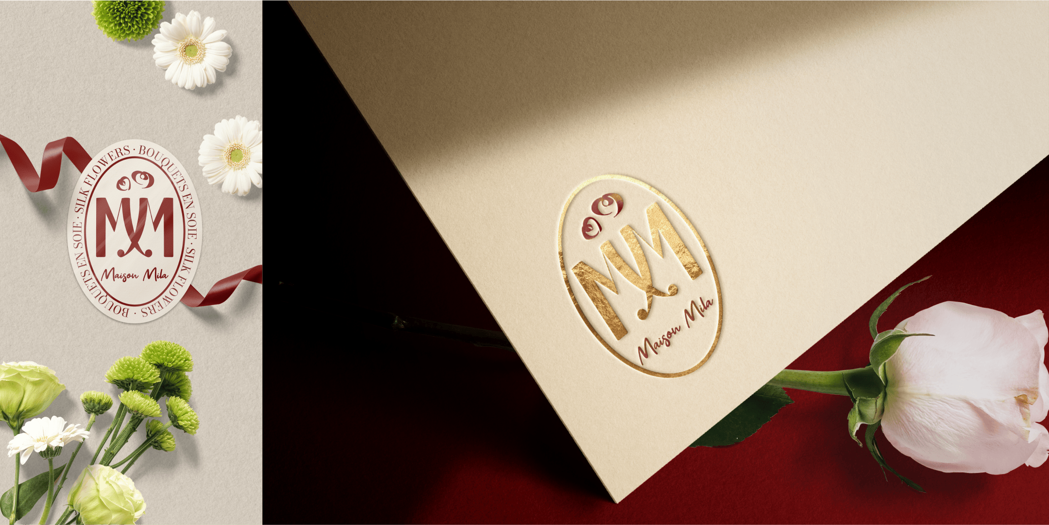
Inspired by Hallmark postcards, the Harrods logo. This version was a classic, tried and true option.
Option 1

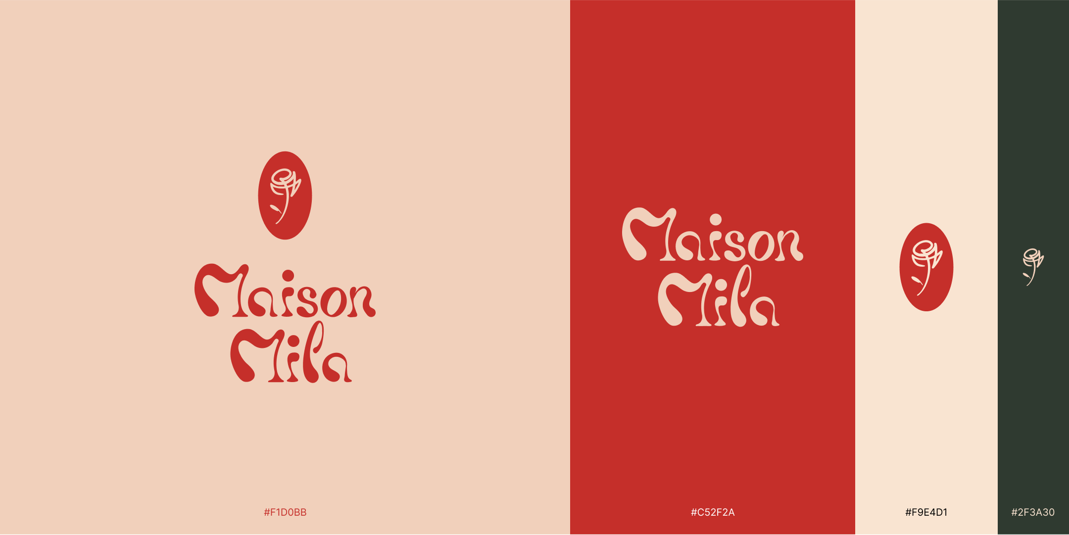
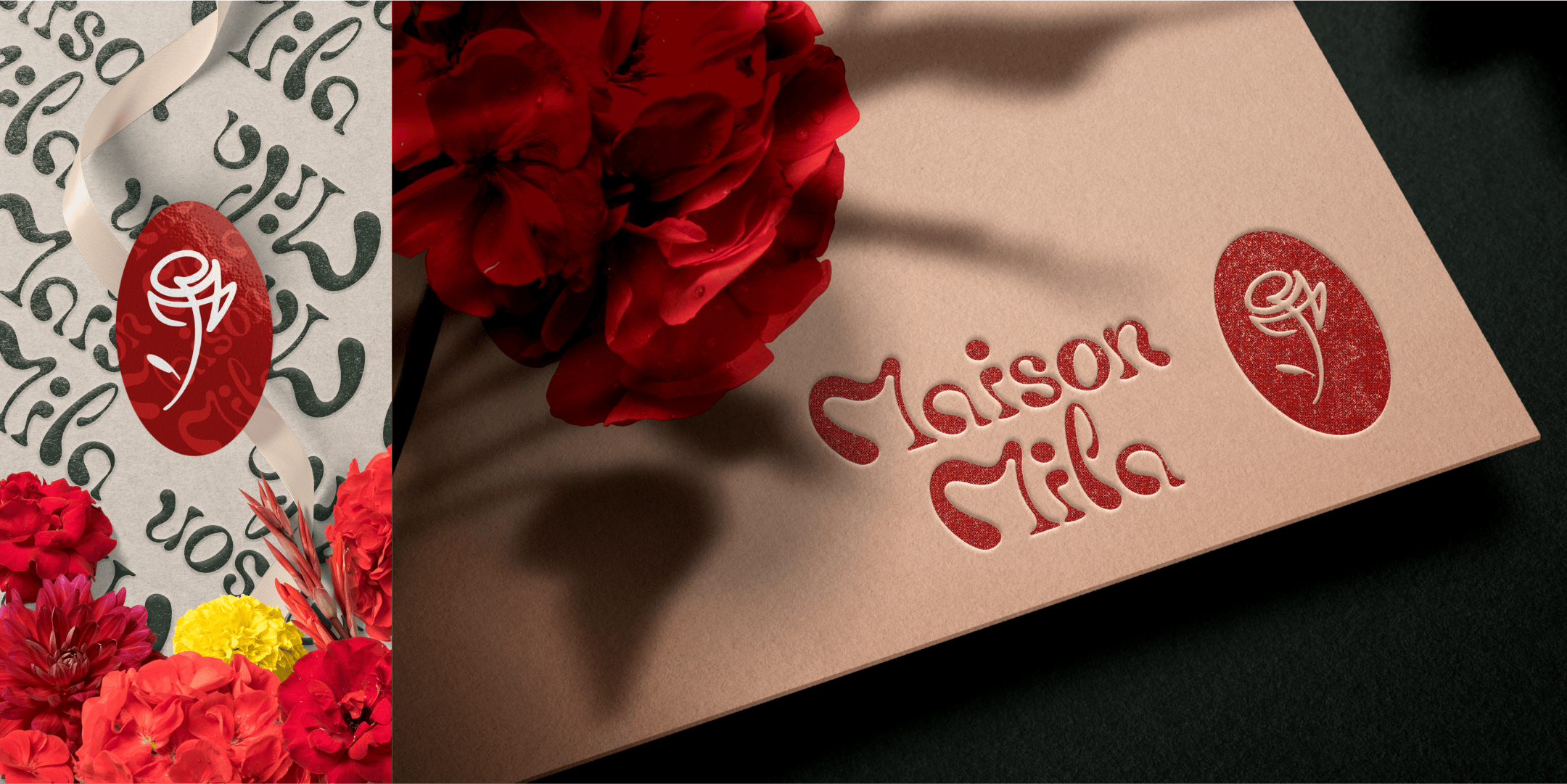
Probably the truest artistic approach, the typeface was hand drawn, then digitally recreated. The Monogram, still sporting the two M's nestled in one-another, creates a rose; an homage to Picasso's one line drawings, a reference to the town of Mougins where the artist spent part of his life and where the business is located.
Option 2


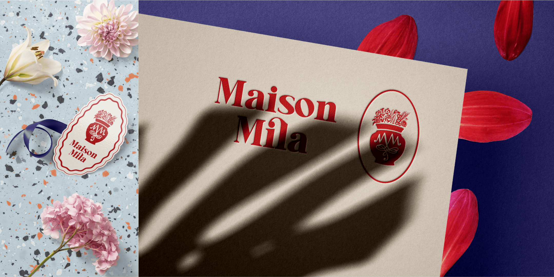
The third option is more institutional, a slab serif typeface for a modern yet elegant look and a hand drawn logo of a terracotta flower pot, like the ones you would probably see in roman villas.
Option 3
